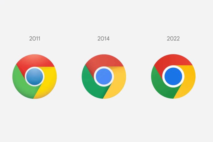
For the first time since 2014, Google Chrome is changing its logo. The new logo’s colors appear to be more vivid.
From 2008 to the present, the Chrome logo has become increasingly minimalistic.
In a post on Twitter, Elvin Hu, a Google Chrome designer, gives a sneak peek at the new logo.
“Placing specific shades of green and red close to each other caused an unsettling color vibration,” according to Google’s design team.
To address this and make the icon “more accessible,” they opted to apply very tiny gradients that I’m confident the human eye can’t even notice to prevent color vibration.
Hu also mentions that the design team tried a white line as a border between each hue, but discovered that it made the entire icon smaller, potentially making it difficult to distinguish from other Google apps.
The main Chrome logo will not be the same on all platforms.
On macOS, the logo has a faint shadow that makes it look to be bursting.
The logo will be more vibrant in ChromeOS to match the other system icons.
The version for Windows 10 and 11 has a more striking gradation to match the aesthetic of other Windows icons.
Over the next few months, the new icon will be made available to everyone.
Read More on Tech Gist Africa:
Facebook changed its name to Meta as part of a rebranding drive to emphasize virtual reality
Square, the payments company founded by Jack Dorsey, has changed its name to Block
Apple overthrows Amazon as the most valuable brand in the world


