
Google is re-designing how mobile search results look, the company stated on Friday in a report. Aileen Cheng, who led the redesign, said in the blog, “We wanted to take a step back to simplify a bit so people could find what they’re looking for faster and more easily.”
The redesign will have larger and bolder text that is designed to be easier to quickly scan, and you’ll see more results from Google’s font. Thanks in part to reduced shadows, search results will also take up more of your screen’s width. Google also says that the redesign will use color “more deliberately” without being distracting to help highlight important information.
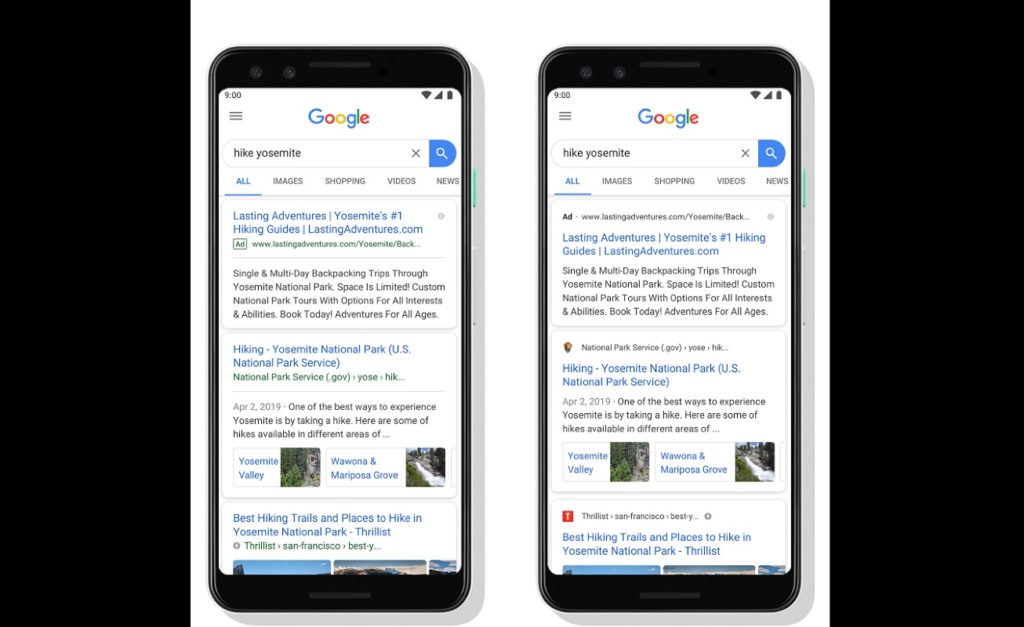
Compare this rendering of the redesign with a screenshot of the current search experience I took from my iPhone 12 mini to get an idea of how the redesign varies from the existing experience.
It seems like the new design brings more data higher up the page and removes some visual clutter, which will ideally make it easier to parse results without requiring you to navigate too far to find what you are searching for.
Google says that in the coming days the redesign will roll out.